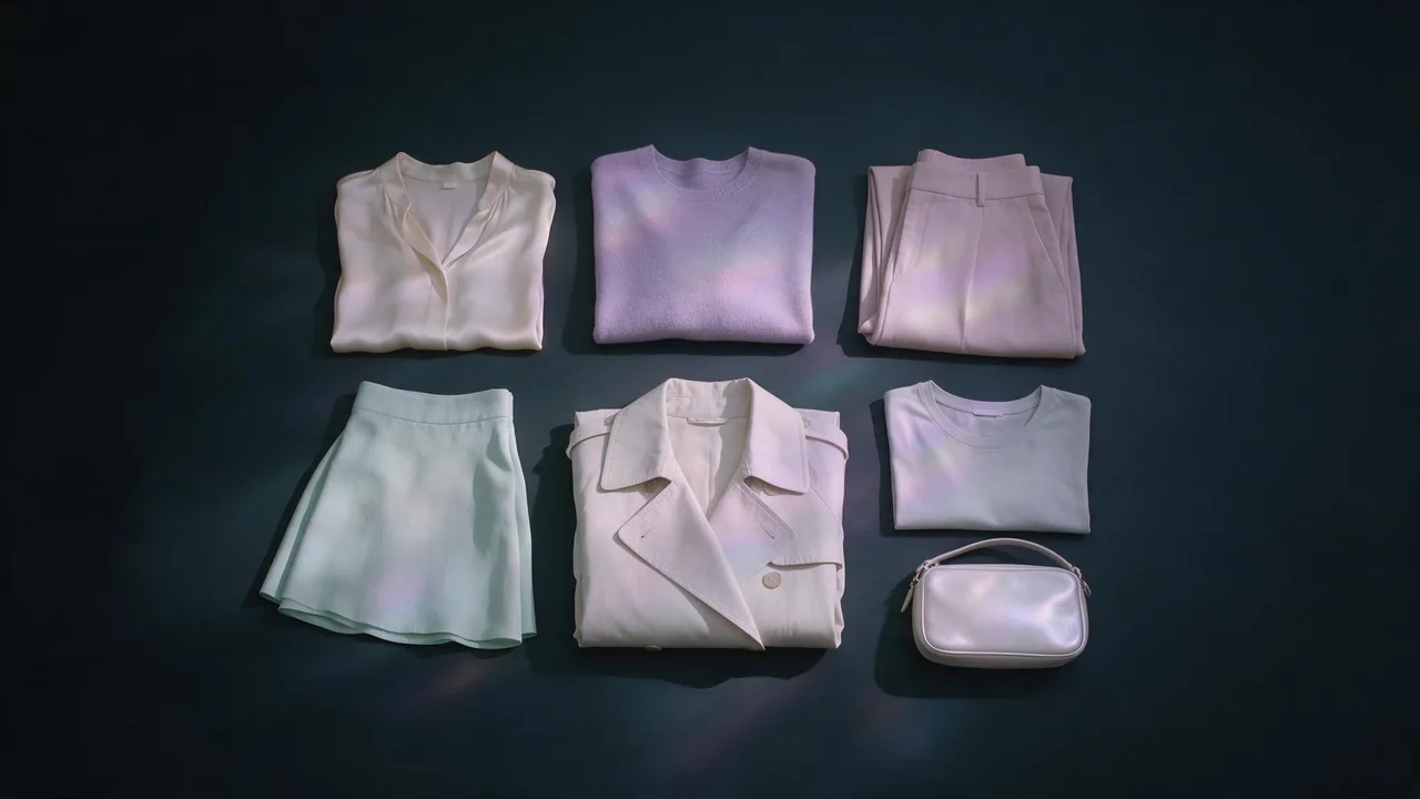
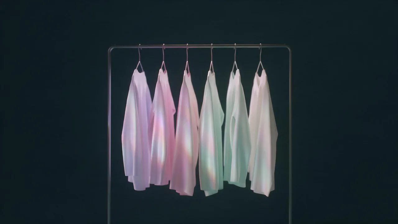
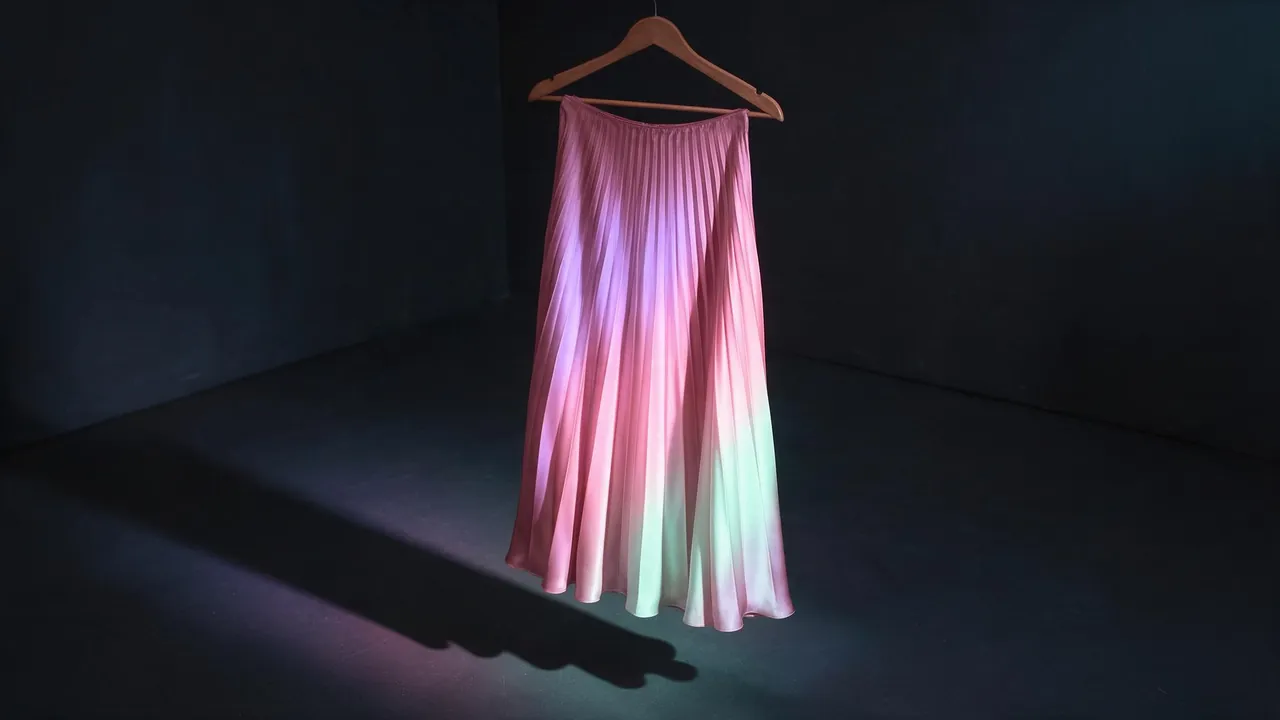
A mood board and colour story for a fashion collection, built with AI
Build a collection mood board from four tiles: palette, fabric, silhouette and light. Then reuse it as a reference so every image in the set keeps one look.
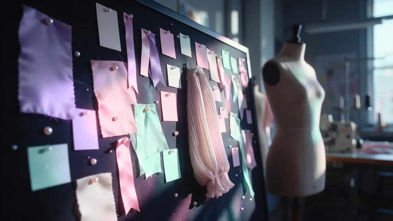
A collection does not start with a dress. It starts with a feeling you can point at: the grey-lilac of a rainy platform, the weight of a wool coat, the way a long skirt moves. Designers pin those things to a board so that forty later decisions all answer to the same one. A set of AI fashion images needs the same board, for the same reason. Without it, image five looks like it belongs to a different brand than image one.
This is a way to build that board with the studio, and then to use it as a working tool instead of a decoration. It is not the same job as a capsule wardrobe, which is about combining pieces, or a lookbook, which is about one model across scenes. This comes before both: deciding what the whole collection looks like.
Four tiles, one board
Keep the board small. Four tiles are enough, and each one answers a single question. Make each as its own image so you can swap one without redoing the rest.
- Palette: which colours, and in what proportion.
- Fabric: what the clothes are made of and how they catch light.
- Silhouette: the outline of the garments, seen on a stand or flat.
- Light and place: the kind of day and room the collection lives in.
Tile one: the palette, with proportions
A palette is not a list of colours, it is a ratio. Say it that way: one base that covers most of the frame, two supporting colours, and one small accent. A collection with five equal colours looks like a paint chart; one with a clear base looks designed.
Flat top-down photograph of an empty wooden table with five rectangular fabric swatches laid in a row, widths unequal. Widest: warm ivory. Next: dusty lilac. Then pale rose. A narrow strip of mint. A thin line of ink-black at the end. Soft overcast window light, no shadows from objects, no text.Name colours the way a buyer would: dusty lilac, ink-black, warm ivory, not just purple, black and white. A modifier changes the temperature of the whole range, and temperature is what makes a set feel related.
Tile two: fabric, because colour lives on it
The same lilac is a different colour on silk, on boiled wool and on cotton poplin. Silk throws highlights, wool swallows them. So the fabric tile is not a second palette; it fixes how the palette behaves. Pick two or three fabrics for the whole collection, not one per garment, and render them as folded or draped swatches in the light you will use later. The fabric texture post covers the words that make weave and sheen read at close range.
Tile three: silhouette, as an outline first
Collections hold together through a repeated shape: a long line, a dropped shoulder, a high waist. Render the silhouette on a plain stand or flat on a table, in a single neutral colour, so nothing else distracts. If the outline is right in grey, it will survive being coloured later.
Product photograph of a long pleated midi skirt and a boxy cropped jacket with a dropped shoulder, hanging together on a dress form against a plain ink-black wall. Both garments in the same flat mid-grey fabric so only the shape reads. Even soft light, full length, 4:5.Tile four: light and place
Light is the cheapest way to make ten unrelated pictures look like one shoot. Choose one kind (cool overcast daylight, low golden sun, a window with sheer curtains) and one kind of room or street, and write it once. The light glossary has the vocabulary. Render an empty version of the place with no clothes at all; it is the quietest tile and the one you will reuse most.
Turn the board into a reference, not a picture to admire
Here is where the board earns its place. A text prompt describes the colours every time and the model reads them a little differently every time. A reference image shows them. Make a single combined sheet of the four tiles, or just the palette and fabric tiles, and pass it to a model that accepts several reference images, such as Nano Banana 2.1 edit.
Use the first image as the colour and fabric board. Use the second image as the silhouette. Photograph a fictional adult woman wearing a garment with that silhouette, made in the palette and fabrics of the board, with the colours in the same proportions. Cool overcast light, plain stone wall, full length, 4:5. Do not copy the swatches or the stand into the picture.Start the first hero image of a set in a text-to-image model such as FLUX 3 text-to-image, and once one frame is right, treat that frame as part of the board too. From then on, edit from it instead of starting over. Browse the options on the models page and run your first board in the studio.
A check before you commit to a set
- Put every image in a row at thumbnail size. If one stands out as warmer, cooler or brighter, it is the odd one.
- Check the base colour first. It should be the largest area in every frame, not just in the first.
- Look at the accent. If it shows up in different places each time, make it a fixed item such as a bag or a scarf.
- Compare skin and background tones too. A warm wall quietly shifts every garment cooler by contrast.
What it cannot do
Generated colour is a close match, not a measured one. You will not get an exact shade from a name or from a reference, and two frames of the same lilac can differ by a step. Colour also shifts with light, fabric and the other colours in the frame. If a collection needs a precise shade for production, treat the images as a direction and match the real dye or yarn in a physical swatch. The board makes a set coherent; it does not replace a colour standard.
Questions
How many colours should a collection palette have?
Three to five, with a clear base, one or two supporting colours and a small accent. More than that and the set reads as a colour chart rather than a collection.
Do I have to make all four tiles?
No. Palette and fabric do the most for consistency. Add silhouette when the shape is the point of the collection, and light and place when the frames will be shot in one setting.
Can I use a photo of a real garment or a real person as the board?
Use your own garments or swatches, and keep every person in the pictures fictional and generated. Never build a board from a photo of a real person.