Print and pattern mixing in AI fashion: florals, checks, stripes and scale
The names for prints a model understands, three rules for mixing two of them, why prints warp and bleed, and how to keep one print stable across a lookbook.
Ask an image model for "a patterned dress" and it will pick a pattern for you, usually a vague floral that changes every time you press Generate. Ask for "a navy and ivory Breton stripe top with a pale rose ditsy floral midi skirt" and you are art directing. Prints are where AI fashion images go wrong most often, and also where a precise word does the most work.
This is a field guide in four parts: the vocabulary, the rules for putting two prints in one outfit, the ways a print fails and what to do about each, and the moment to give up on prints and choose a solid. The model in every example is fictional, Ines Laurel, invented for this page.
Name the print, not the idea of a print
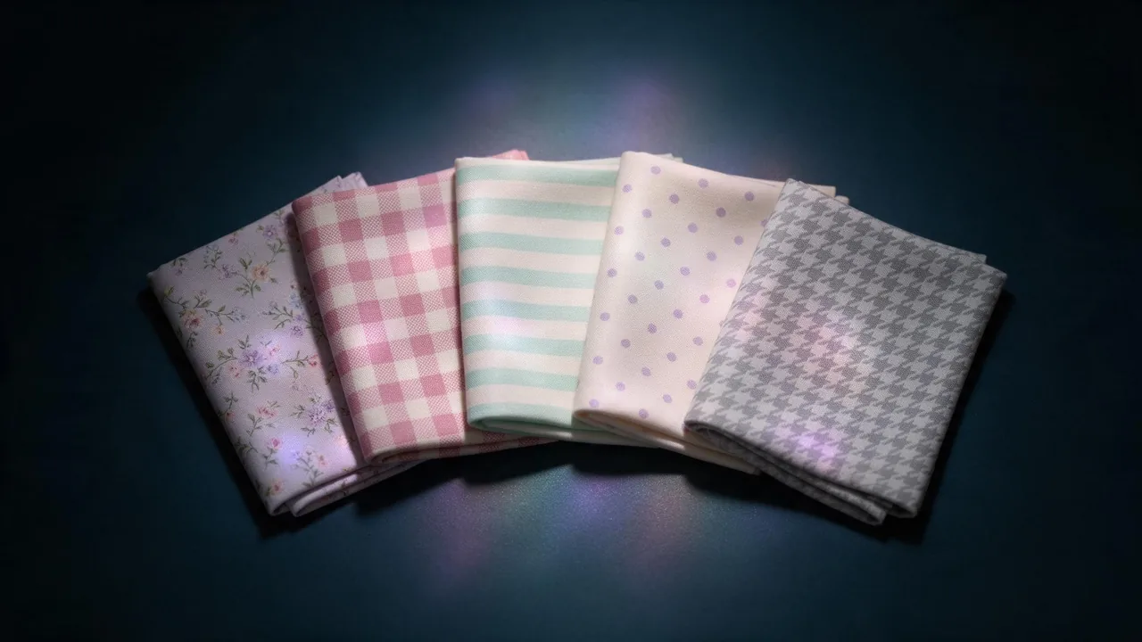
Image models were trained on catalogues and fashion captions, so the trade names are the ones they know best. A named print comes back closer to what you meant than any description of shapes. The ones worth knowing:
- Ditsy floral: many tiny flowers scattered close together. Reads as one soft texture from a distance.
- Large-scale floral: a few big blooms, often on a dark ground. Dramatic, and the hardest to keep identical between frames.
- Gingham: an even two-colour check of crossing bands. Say the check size: "small" or "half-inch" helps.
- Houndstooth: a broken check of jagged four-pointed shapes, classic in black and white tailoring.
- Pinstripe: very fine vertical lines on suiting. Ask for "chalk stripe" when you want them wider and softer.
- Breton stripe: horizontal bands on a knit top, traditionally navy on ivory.
- Paisley: curved teardrop motifs with inner detail. Busy, so it wants a quiet partner.
- Animal: leopard, zebra, snake. Name the animal and the colourway, or it defaults to tan leopard.
- Polka dot: round dots on a plain ground. Say the dot size and spacing.
- Abstract: brushstrokes, blocks, marbling. The least predictable; describe two or three shapes and colours.
Add the colourway every time ("rose on cream", "black on white") and the fabric (silk, cotton poplin, wool suiting), because the same gingham looks different on a crisp shirt and on a draped dress.
Three rules for mixing two prints
Pattern mixing works on a person for the same reasons it works in a picture. The model will follow these rules if you write them into the prompt; it will not invent them for you.
- One large, one small. Pair a bold scale with a fine one: a wide Breton stripe with a ditsy floral, a large floral with a small gingham. Two prints of the same scale fight, and the model tends to merge them into one.
- Share a colour. Make one colour appear in both prints, and say so: "the navy of the stripe repeats in the floral". This is the thread that makes two prints look chosen.
- One dominant. Let one print cover more of the body (a skirt, a coat) and the other a smaller area (a top, a scarf, a bag). Two equal halves look like a costume.
Full-length fashion photograph of a fictional adult woman named Ines, standing in a pale stone courtyard. She wears a fitted navy and ivory Breton stripe knit top with wide stripes, and a flowing pale rose midi skirt in a small ditsy floral where tiny navy leaves repeat the navy of the top. The skirt is the dominant print; the top is cropped at the waist. Soft overcast light, 85mm, 4:5.Classic safe pairs to start from: stripe with floral, check with floral, polka dot with stripe. Animal print with almost anything works if the other print is small and shares its brown or black. Two florals is advanced; give them very different scales and the same palette.
How prints fail, and the fix for each
Once you know the failure, you can see it in a thumbnail. These are the four that turn up most.
- Warping on folds. Stripes and checks should bend with the fabric, and a model sometimes draws them straight across a fold or kinks them at random. Choose fabrics that drape simply (a straight skirt, a fitted knit) and ask for "the stripes follow the folds of the fabric".
- Bleeding across garments. The floral from the skirt creeps into the top, or the whole outfit becomes one print. Separate the garments in the prompt with their own colours and say "the top and the skirt are separate garments with different prints".
- Moire and shimmer. Fine pinstripes, small houndstooth and tight gingham can produce wavy interference patterns, especially at full length where the print is tiny. Go bigger on the print, or frame closer.
- Melting motifs. Dots that merge, flowers that turn into smudges near seams and edges. Usually a sign the print is too small for the framing; enlarge it or crop tighter.
Keep one print stable across a lookbook
A text prompt redraws the print from scratch every time, so the same floral skirt comes back with different flowers in every frame. The fix is the one the lookbook workflow uses for garments: render the printed piece once, flat on a plain ground, pick the best version, and from then on pass that picture as a reference instead of describing the print again.
Bria Virtual Try-On takes a person photo plus one to three garment references, so the printed skirt goes on Ines from its own picture. To move her into new scenes afterwards, Nano Banana 2.1 edit accepts several reference images at once; pass the dressed frame and the flat print reference together, and say in the prompt that the print must match the reference.
Show the woman from the first image sitting on a low wall at golden hour, full-length, 4:5. Keep her face, hair and both garments exactly as they are. The skirt print must match the second image: same flowers, same scale, same rose and navy colours.Even with a reference, expect small drift: a flower moves, a stripe count changes at the hem. A large, simple print holds better than a fine, busy one, and a print seen flat on the front of a garment holds better than one disappearing into a deep fold.
When a solid is the better call
Prints are a risk you take on purpose. Choose a solid when the frame is about the face or a beauty detail, when the outfit has to repeat across many frames and the print is fine or complex, when the light is the story (see the light glossary), or when the garment already has strong texture such as a rib knit or a heavy satin. A common compromise: one printed piece per look, everything else solid in a colour pulled from the print. The capsule wardrobe post shows how far solids alone can go.
Write the brief first (the art direction guide helps), pick a model on the models page, and try your first mixed outfit in the studio. Keep the model fictional: a generated character, never a photo of a real person.
Questions
What is the easiest pair of prints to start with?
A wide stripe on the top with a small floral on the skirt, sharing one colour. The difference in scale is obvious to the model, so the two prints rarely merge.
Why does my striped dress look wavy or shimmering?
That is moire: a fine repeating pattern rendered too small for the frame. Ask for wider stripes or a bigger check, or frame the shot closer so the print has more pixels.
How do I get the exact same print in every lookbook frame?
Render the printed garment once on a plain ground, keep the best version, and pass that picture as a reference in every later step instead of describing the print again. Expect small drift and check each frame at full size.